
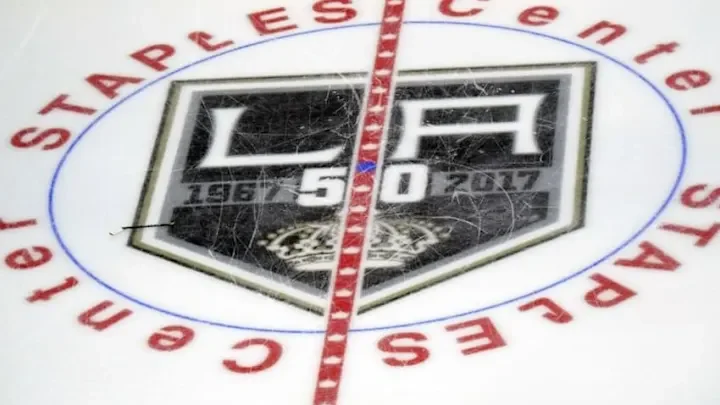
LA KINGS 50TH ANNIVERSARY

LA KINGS 50th anniversary logo
One of my earliest and most memorable projects as a graphic designer was creating the LA Kings’ 50th Anniversary logo. It was my first big assignment, and it came with the responsibility of honoring five decades of the team’s history while designing something modern that could stand proudly on jerseys, merchandise, and in the arena. Balancing tradition and innovation, I worked to capture the team’s legacy with a bold, celebratory mark that resonated with both longtime fans and a new generation. That project not only sharpened my skills but also set the tone for my career, showing me the impact design can have when it connects with a community’s passion.


early concepts
The LA Kings tasked us with incorporating key elements that honored their history: the milestone years 1967 and 2017, five stars or diamonds to represent their retired banners, and two additional stars or diamonds symbolizing their championships at the time. In the early stages of development, our focus was on building a strong visual identity around the number 50, while ensuring that the team’s logo served as a complementary, secondary read within the overall composition.


final design
We ultimately chose to center the design around the LA Kings’ primary logo, building upon its foundation rather than reinventing it. The crown was reimagined by replacing the contemporary version with the original 1967 crown, which was a deliberate nod to the franchise’s beginnings. Incorporating gold created a striking departure from the team’s standard color palette, highlighting the significance of the milestone and making the mark feel special. To further emphasize the Kings’ journey, we integrated the anniversary years, tying the past and present together. While the design wasn’t a dramatic departure from their existing identity, it successfully honored their 50th anniversary while celebrating the team’s history and achievements.