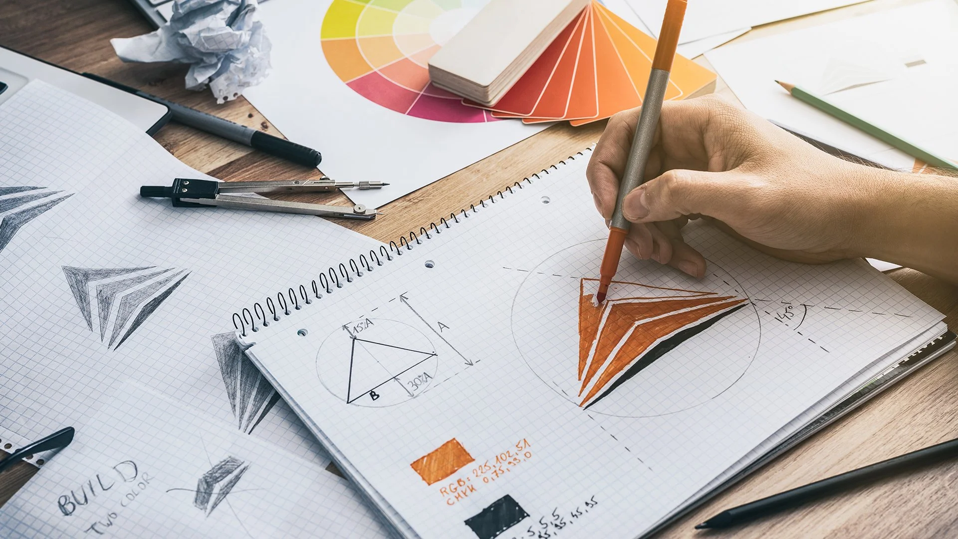
LOGOS
I love creating logos because they’re the ultimate blend of storytelling and simplicity. A great logo has to capture the essence of a brand in a single mark, distilling personality, history, and vision into something instantly recognizable. For me, the fun lies in that challenge: finding creative ways to embed meaning, craft a narrative, and make every detail feel intentional, all within the constraints of a simple shape or wordmark.


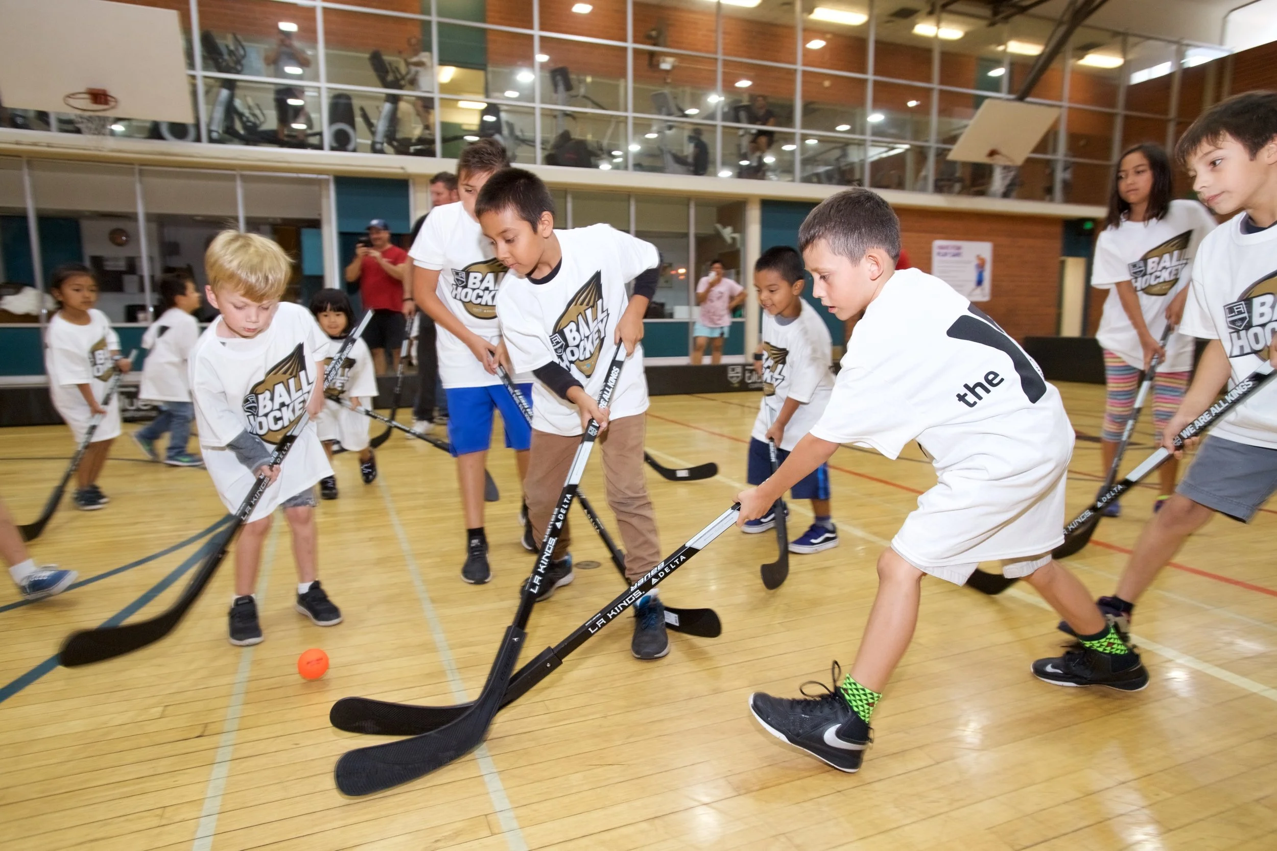
LA Kings Ball Hockey
I designed the LA Kings Ball Hockey logo to capture the energy and accessibility of the game while keeping it rooted in the team’s identity. Inspired by the Kings’ brand, the logo emphasizes movement, playfulness, and inclusivity, highlighting that ball hockey is fast-paced fun for kids of all experience levels. The result is a mark that feels connected to the LA Kings while standing on its own as a symbol of community and excitement.

LA Lions
I created the LA Lions logo for the girls’ hockey team by drawing inspiration from the LA Kings’ iconic branding. The goal was to design something that felt connected to the Kings’ identity while also giving the Lions their own sense of strength and individuality. By adapting the Kings’ visual language and reworking it with a bold lion mark, the logo captures both tradition and empowerment, giving the team a professional look that represents pride, energy, and confidence on the ice.

The ZEVAS
I designed the ZEVA logo for the LA Auto Show to embody innovation, energy, and forward momentum in the world of zero-emission vehicles. The bold typography conveys strength and modernity, while the lightning bolt integrated into the “Z” symbolizes electricity. A vibrant gradient palette reinforces the sense of progress and sustainability, giving the logo a fresh, dynamic look that aligns with the cutting-edge spirit of the event.